2 May 2010
presentation of work
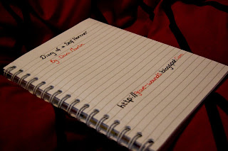
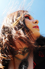
so while i was at it i decided to create a cover for my dvd as well as a sheet with my blog on (as we was asked to write it down!) and i thought that was a little boring so i took two photos, one with my blogger address on it and printed that, and another to create my title dvd sleave for my dvd case.


The Final piece and evaluation *drum roll please*
Diary of a self harmer by Dani Martin
So i finally finished editing together my work and uploading it. And here it is. Overall i prefer it alot to my christmas peice which was diar compaired to this in my own personal view. I wanted to work alot more on producing that polished look in comparison to my last video which i personally felt was abit poor in quality. I desided you use a more natural lighting, and editing it alot slower, with more transitions and more panning shots included. I wanted to insted of pressing on the idea of sorta horror, dark, ect which is what my last video was leaning more towards, this one i wanted to give the audience more of an understanding of how emotionally numb and slow and just well, the video being slow i think it just explains some of the feelings abit more then focusing on the torment of my first video. I kept some of the visuals the same, and added more, such as the scribbled out face was and idea that steamed from the idea of not being able to show who u really are, hiding, mixed with the scribble scene form my first scene. i think the lip scene, while not being so dark, captures the feeling of being silenced abit better being sandwhiched between the two images in the mirror, the first showing that the person does want to ask for help,but the touching of the mirror implying intrapment, and while being alot lighter and less contrasted (in lighting this scene) is doesnt seem so horrific, but still keeps its power.i used cross fades as the transition of choice and this was done to show one moment blurring into another which is what is often felt. like its all leading on from each other. and i also used the diary for the start and final images because of the idea that what we are seeing is the visual interpriation of the diary. The music played an important role in helping to order the visuals, as well as choosing to edit alot slower rahter then the style before of just POWPOWPOW one image after another flashing on screen. I also decided to take abit of a surrealist idea in the 'dream sequence' which is the candles surrounding the objects of self harm and sucide, and then showing the person waking up, but it doesnt end after she does. my favourite scenes are the two start 'numbs' the skin one and the hand one, just because they fit so well in with the music, and prob the least fave part is the 'still' from the video of the scribbled out face with the numb wrote on it, just due to the fact that it looks to static, the other images that i used 'stills' from the video doesnt look to bad because they are editing amongst other things, and if i had to redo one thing it would to animate that still slightly. Personnally i am alot more confident in this piece then i was my original video (before christmas) and feels it works alot better as a piece.
So i finally finished editing together my work and uploading it. And here it is. Overall i prefer it alot to my christmas peice which was diar compaired to this in my own personal view. I wanted to work alot more on producing that polished look in comparison to my last video which i personally felt was abit poor in quality. I desided you use a more natural lighting, and editing it alot slower, with more transitions and more panning shots included. I wanted to insted of pressing on the idea of sorta horror, dark, ect which is what my last video was leaning more towards, this one i wanted to give the audience more of an understanding of how emotionally numb and slow and just well, the video being slow i think it just explains some of the feelings abit more then focusing on the torment of my first video. I kept some of the visuals the same, and added more, such as the scribbled out face was and idea that steamed from the idea of not being able to show who u really are, hiding, mixed with the scribble scene form my first scene. i think the lip scene, while not being so dark, captures the feeling of being silenced abit better being sandwhiched between the two images in the mirror, the first showing that the person does want to ask for help,but the touching of the mirror implying intrapment, and while being alot lighter and less contrasted (in lighting this scene) is doesnt seem so horrific, but still keeps its power.i used cross fades as the transition of choice and this was done to show one moment blurring into another which is what is often felt. like its all leading on from each other. and i also used the diary for the start and final images because of the idea that what we are seeing is the visual interpriation of the diary. The music played an important role in helping to order the visuals, as well as choosing to edit alot slower rahter then the style before of just POWPOWPOW one image after another flashing on screen. I also decided to take abit of a surrealist idea in the 'dream sequence' which is the candles surrounding the objects of self harm and sucide, and then showing the person waking up, but it doesnt end after she does. my favourite scenes are the two start 'numbs' the skin one and the hand one, just because they fit so well in with the music, and prob the least fave part is the 'still' from the video of the scribbled out face with the numb wrote on it, just due to the fact that it looks to static, the other images that i used 'stills' from the video doesnt look to bad because they are editing amongst other things, and if i had to redo one thing it would to animate that still slightly. Personnally i am alot more confident in this piece then i was my original video (before christmas) and feels it works alot better as a piece.
1 May 2010
MY WORK- the editing and abit of 'splaining
So i had to take a slightly different approach to editing this video in comparison to my video before handin. Mainly because of the music soundtrack im using is alot slower, so instead of using all fast cuts, i used alot more transitions and alot slower shots, i even desided to film some panning shots to add more movement to the video, which actually works really well with the music i chose to use. it adds more of a flow to it. I also gave it a title, 'diary of a selfharmer' mainly because the intro shots and finishing shots are going to be of a diary, but also because i wanted to show slightly the progress between what happens when this person has the breakdown. By having the dairy at the start and at the finish i feel it adds more of a narrative to it, such as the idea that what the audience is seeing is a direct visual representation of the feelings this person is putting in the diary. Also going from what my lecturer said to me to try and encorperate some of the lyrics into the video as words, which ive done by filming shots of close ups of the body with text on it. as well as that, i did try and add the visuals to fit well with the lyrics. at one point it says a line about screaming and the visual on screen matches up. at some points i did find it hard to edit with the song, others it came alot more easy. i used alot of cross fade transitions but thought carefully about when they should been added.
i also chose to include some stills from the video in the video if that makes sence? i took the shots that wasnt working very well (even sometimes after i reshoot them! mainly the banages shots) and took a single frame from them, working as like a photograph and encorperated that into the video,which isnt exactly what i planned on doing but i addapted my work to fit what was psycially possible.
i also chose to include some stills from the video in the video if that makes sence? i took the shots that wasnt working very well (even sometimes after i reshoot them! mainly the banages shots) and took a single frame from them, working as like a photograph and encorperated that into the video,which isnt exactly what i planned on doing but i addapted my work to fit what was psycially possible.
Subscribe to:
Comments (Atom)


